When we first started 3tone Digital in November of 2022, we went straight to business and started networking (both in person and on social media), optimizing the website, and obtaining clients and leads.
In regards to 3tonedigital.com, over the past year and a half:
- We improved the user-experience by using A/B test results (via Hotjar)
- We interlinked a variety of our services, taxonomy, projects, and blogs
- We ranked our own site up to result #1 for “web design Clifton Park” and “web development Clifton Park”
- We learned a lot about real business and bookkeeping!
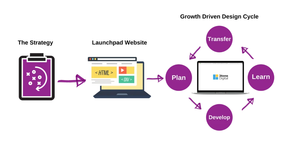
Without much thought we just did what we do best: fixing, improving, and building websites.
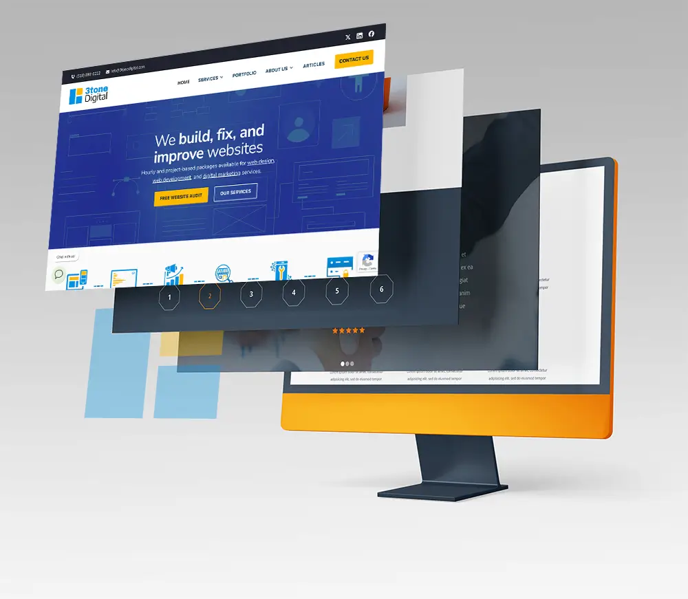
We updated our headers, the footers, the inner templates were widened and overall everything was modernized..
..but, the logo.
We got used to the logo for sure, and I think we were both afraid to change it because it was essentially the very last and only branding element that hadn’t changed over the Growth-Driven Design implementations.
We started by simply vectorizing the existing logo, but – meh – we weren’t that happy with it. So, we decided to visually talk about what 3tone Digital means to us, out loud and right there in the Figma file.
A few of the final contenders below:
About the block element
“Wireframe Icon”
Simplifying the box concept down from a 3D cube to a flat design really called out to us.
After some self-reflection on who we are (and want to be) as a business over tea and chill-hop music, we iterated through logo designs and feel like we ended up with one that not only represents our process of working with clients, but also stands for the essential blocks that we use to build digital presence upon.
The cube became a masonry card grid of sorts – an element we’re used to implementing in our web development services.
With this new simplified shape, we made the colors more flat and modern, utilizing a brand color that we actually only started adopting as our own after the solar eclipse of 2024:
#FCB900: Selective Yellow
RGB: 252, 185, 0
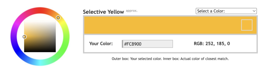
The yellow that we’ve been using is hex value #FCB900 and called Selective Yellow. While most importantly this color change of buttons from blue to yellow has drastically increased our click-thru rates (who knew?), it actually signifies a variety of things to us:
- Oooh: That light-above-your-head “ah ha” moment when something clicks. Like a Sim when it learns a new skill.
- Uniqueness: Identifying and implementing the unique tone of our every one of our clients website projects.
- Our glorious sun: The sun is our oldest and most reliable source of energy, a constant reminder of the natural brilliance that fuels all innovation.
- Energy & warmth: We strive to be as real and human as possible with our clients and their projects, and we hope our vibe rubs off.
#0393E3: Cerulean
RGB: 3, 147, 227
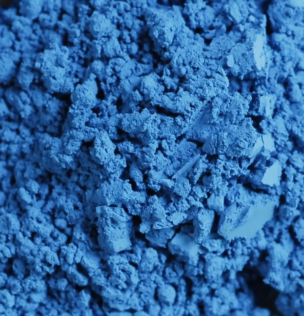
To even out the brightness of our new yellow with a more dynamic vibrance, we went with a color whose hue of blue is the originated from the Cobalt family.
While we’re not biting on his style, we promise.. Claude Monte was one of the first traditional artists to incorporate variations of this color into his pieces.
While my wife and I travelled to Paris, for the first time, two years ago we had visited a beautiful museum called “Musee d’Orsay Paris”. Monet’s masterpieces and usage of color (what we later found out to be Cerulean) really called out to us and we believe it is the perfect vibrant contrast to Selective Yellow.
Fonts: Archivo Black & Encode Sans
We decided to go with two different fonts and weights to represent that 3tone covers all things digital.
The Archivo family is similar in style to fonts from the 1800s, it has since been updated to become a variable font (which is a great type of font for responsive web design), being variable allows it to vary in thickness and width based on factors such as screen size and device.
The Encode family is composed of simple curved and straight letterforms that stay crisp and legible at many sizes.