Have you ever heard of the Winchester Mystery House? The Winchester House is a mansion in San Jose, CA that now exists only as a tourist trap (just like the other mystery spots, imho).
The mansion was built by Sarah Winchester, wife of William Winchester (of Winchester Repeating Arms Company fame). After his death, his widowed wife Sarah never stopped chaotically adding onto that 24,000 sq. ft. mansion.
And in total, the mansion sports:
- 10,000 windows
- 2,000 doors
- 160 rooms
- 52 skylights
- 47 stairways and fireplaces
- 17 chimneys
- 13 bathrooms
- 6 kitchens
- ?
A peek inside the Winchester House
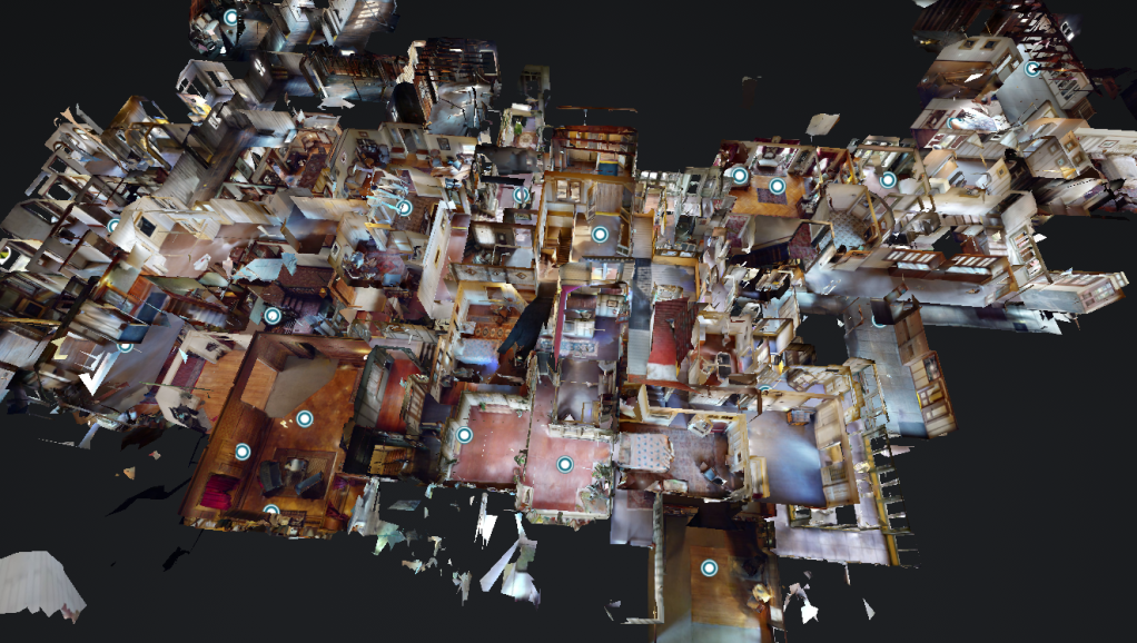
I have personally been on two different tours of this insanity and can report back that there are indeed many stairways that lead up to nothing but walls, small doorways that open to 40ft drops from the second floor, and an overall cacophony of very odd halls, silly rooms, and overly-crowded interior designs.
There are a couple movies based off the Winchester House (none of them enough to write home about) and the mansion has been on a few paranormal ghost-hunting shows!
But, at the end of the day – Sarah’s mansion is surely not functional or comfortably livable, it’s actually a giant winding mess.
Which brings me to the point of this post: It’s pretty easy for a website to become a digital version of the Winchester Mystery House over the course of time.
The “Winchester website”
Similar to how a skilled contractor, experienced building developer, or talented interior decorator can transform a space into a unique experience, a good web designer can take a website from zero to hero by setting a clear subliminal path for the visitor to take action without the overuse of elements, colors, textures, and materials.
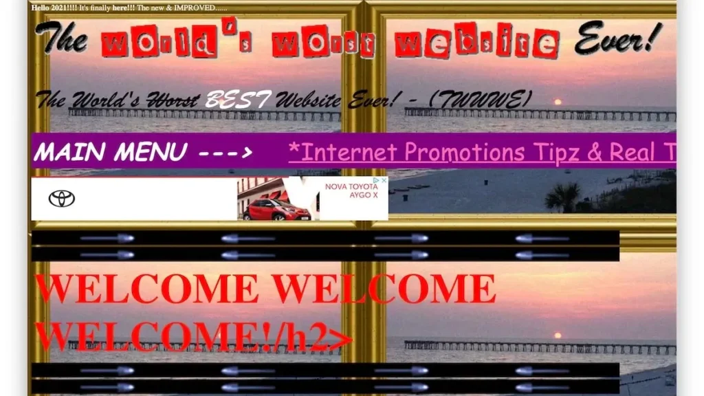
Unlike Sarah Winchester, who didn’t know when to stop, a skilled website designer will very frequently do just the opposite – eliminate extra confusing fluff that does nothing besides misdirects the user.
Blindly adding new pages and sections that lead nowhere can add to a poorly designed maze of confusion causing frustration for visitors, just like Sarah’s crib.
While it might be difficult for some, knowing when to stop adding onto a finished product and rather simply improve upon what is already there is essential to establishing a good social credit score with search engines like Google.
Working with what you got
As much as we love website redesign projects, tearing down and starting a website over from scratch is not always the answer – but neither is endlessly and aimlessly adding new pages and sections.
In fact, instead of completely destroying or consistently adding, optimizing the content of your website is almost always a better decision!
Optimizing can do wonders! It involve techniques like interlinking, compressing, and improving content for search engines to index.
Focus on improving instead of adding
- Simplify Navigation: Make menus intuitive and easy to navigate.
- Improve Load Times: Optimize images and minify CSS/JavaScript.
- Streamline Content: Consolidate pages and remove outdated info.
- Enhance Mobile Usability: Ensure your site is fully responsive.
- SEO Optimization: Use relevant keywords and meta descriptions.
- Engaging Visuals: Use high-quality, strategic images.
- User-Friendly Forms: Simplify and test forms for ease of use.
- Consistent Branding: Maintain a cohesive look and feel.
- Regular Updates: Keep content fresh and current.
- Monitor and Analyze: Use analytics to guide improvements.
It’s easy for a website to become a Frankenstein parody of itself once there are too many hands (or just one overly-eager hand) in the soup, we see it firsthand!
And with WordPress, there’s not much preventing a website editor from becoming their own version of Sarah Winchester. WordPress makes it easy, and even fun, to create and build, but just because you can doesn’t mean you should.
That’s why we believe that the best course of action for a well-designed user-converting website (preferably one from 3tone Digital) is to improve upon what is already there by updating and interlinking your blog posts, linking related text to your services or products, optimizing your content, and improving the overall user experience.
In conclusion, and without any assistance from ChatGPT (..I don’t roll like that), the more you build, the more there is to manage! Managing less is easier than managing more, and more doesn’t always equate to better – sometimes adding more does just the opposite.
If you need tips on how to improve your website, we’re always ready to help. Contact 3tone Digital to set up a free consultation and let’s get the ball rolling.

