Video Transcript
Good morning, everyone!
Good morning! Today is Tuesday.
Thursday. Today is Thursday. Happy Thursday from 3tone Digital!
Almost Friday.
Almost Friday. It’s Friday Jr., they say.
That was a selection by Lionel Richie, “Stuck on You.” Classic.
Real classic. I was just playing “Hello,” which I consider one of the best songs, especially from the ‘70s, on piano last night. It’s such an amazing, beautiful song.
I heard “Dancing on the Ceiling” when I was young. It was one of my favorite songs.
Oh, what a feeling, dancing on the ceiling. That’s a good song.
So, start us off. It’s latte time. I have a plain, basic coffee from a mug given to me. Maybe you can see it. Look. I’m trying to have it. Oh, wait. I can just, before I knock this over. OK, there we go.
Yeah, we need a new laptop. Looks like bunny ears. You can kind of see the latte art in there as I’m sifting through here. But I’m having an almond latte with a little bit of mocha topping on top. It’s a little fancy ritual I do mostly every morning.
Fancy Friday Junior. Yep. And this cup was given to me by my father-in-law. It actually came with, which was weird, a hook to mountain climb kind of thing.
Oh, yeah. Where is that?
It’s in my laptop bag.
Oh, okay. I was like, how weird. And I know it’s like a guy thing that they just add it on because it’s for guys. So they’re like, what can we add that’s cheap and brandable? Red manly hiking hook.
Yeah. Go climb a mountain.
Yeah, especially with the cover. I guess you can hang it off a bag or something, but it’s still ceramic. It’s going to crack, I think.
Yeah, I think it’s to use it for other stuff.
Lionel Richie is still playing in the background. Very, very lightly, as he should be.
Oh, I just realized you got us in very yellow squiggly lines over here.
Do you like it? It’s actually a video. It’s moving.
Oh.
Yeah. It was between that. I was going to go with this, like to go with the stuck in an era.
Yeah, like we’re in a spaceship.
Or this one.
No, too distracting.
Yeah, if we were in like the actual boxes, it might be cool. But yeah, I like the yellow.
All right, we’ll be bright today. Put the logo there too, see? Now it shows because the other ones are blue.
Yeah, it looks good.
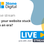
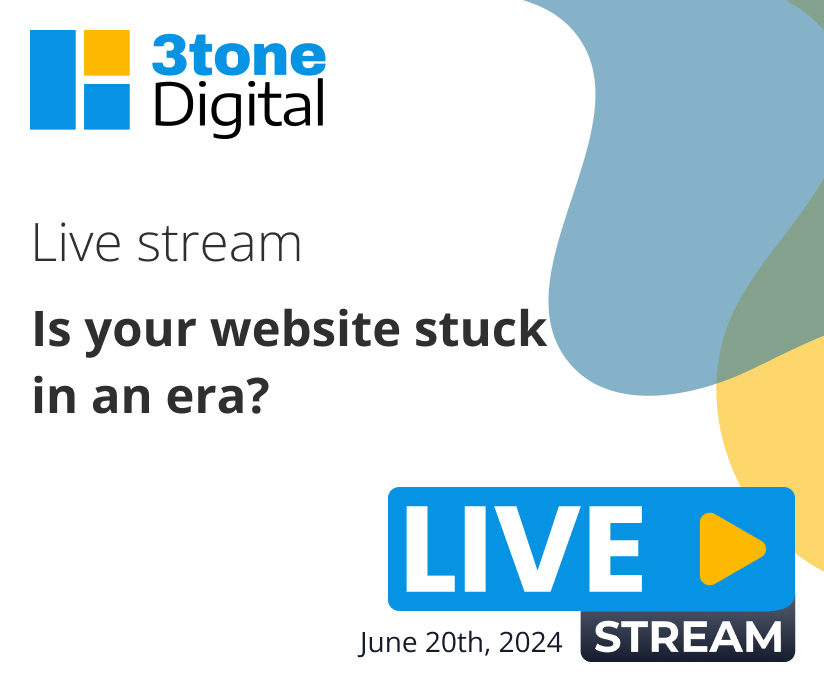
All right, so today we are going to be talking about how to identify if your website is stuck in an error. So we’ve seen a lot of websites and there are key indicators that show a site is stuck in the air. So we’re going to go through and give you some tips on how to have a modern website, as well as point out some really overly extremely bad websites.
Maybe a little bit too extreme but it is a good example to take a look.
Well, I picked through some of them. I didn’t pick the ones that were outrageously bad because they didn’t make sense, but there’s some interesting ones in there that I can share in a second.
You want to go over the tips first?
Yeah, let’s go over the tips. So here are five tips to kind of get your website up to modern times. If you look at the most modern websites, they have a good use of white space. And that means just spacing out. Things aren’t crowded together. Don’t be scared of some white space. It’s good for the flow of your eye to kind of navigate where the user should look. And it’s clean. It’s a super clean look. So adding white space.
Yeah, and one tip that I just remembered that I learned in college was that eyes in studies tend to look in an F-shaped pattern. And using white space to define the F-shaped pattern in terms of navigation, logo, the next line being the important thing, and then on the left side going down. That’s what I learned. I don’t know if it’s still relevant, though. It was 20 years ago.
Yeah, it makes sense. They probably did some studies and tests to prove that.
Yeah, unless the letter changed. Who knows?
Unless people are identifying things different.
Yeah, exactly. So F-shaped white space is one of the best uses.
And also the golden ratio, too. But that’s like a whole different Terrence Howard topic.
All right. So the next one is the larger headlines are easier to be able to point out the important topics. Having easy-to-read, bite-sized body copy, the use of bullets and things throughout your copy, within your blogs. It just is easy for scanners and people who are just quick to just pick up the key points. So you want to make sure your headlines really stand out in a way and are easy to read.
Yeah. And Tony’s tip, I’m just going to jump out with Tony’s tips here. The bigger the font, the less the weight of the font can be for readability. And of course, letter spacing. It’s called kerning back in the day, but now letter spacing on browsers. A lot of times we see like bold, which bold fonts are beautiful, but with the letter spacing so close, it looks crazy. It’s hard to read, especially like right when you look at it off the bat. So lightening font weights and spreading them apart a little bit is very helpful with the large headlines. Let me step out.
And then when it comes to your brand colors, making sure that your color palette is inviting. And I know every business has its own vibe and things like it really depends on what it is, right? Maybe the dreary Halloween, I don’t know if that’s a specific type of brand, then maybe that’s a little different because you have a following and it’s a specific topic. But overall, if you’re a business, you want to make sure that your color palette is inviting, it’s fresh, it doesn’t contrast. You’re using complementary colors that offset each other nicely. That is an important thing to choose for sure. And making sure that you roll it out nicely and not overuse an accent color too much because it could really take away from your entire website.
Tony’s tip. Color usage is important. And there’s lots of tools out there online that can tell you. I like to relate it. It’s almost like music, where there’s a major chord and a relative minor and sevenths. And color is the same way, but it’s like relative associations for accent color. So if you pick a certain blue, on the other side of the color wheel, there’s another complementary and supplementary color that you can always use. Some of them look goofy. Some of them will look like McDonald’s. But you can use shades of those to stay within a color scheme. I mean, if you pick blue, you don’t got to just use blue. We did some color study with our blue and our yellow that they go together. Because if you just go a little bit off, they can look really crazy. Even though they’re on different sides of the spectrum in terms of the color wheel. Yeah, definitely. Tony’s tip out.
So when it comes…
Oh, no. I’ll take it over. I’ll take it. You want to take a sip of something.
I’m losing it, guys. Hold on. Let me drink some water. I’ll intro number four.
Number four, full-width photos or videos equals modern, which we’ll show in a couple of seconds, these bad websites. But yeah, tight, like these column things, obviously, they’re old. There’s time and place for it, of course. And mobile really is that sort of tight column website in our hands because you can’t really go beyond the viewport for now. I don’t want to take it from you, but if you want to continue, number four.
Oh, so with modern sites, usually you’re seeing instead of those really small videos, they’re hard to see. There’s a larger full-width video. It looks better. It really depends on the layout, but I’ve seen it on header images and even throughout the sections of the page. It just gives more of a statement. And those small ones, but let’s say there’s like a podcast website, then usually instead of like a box card image, they might have a card video. That’s because they have a library of them. So that’s a little different. But when we were talking about the homepage, full-width is where it’s at. Photos and videos.
Yeah. Tony’s tip, full-width and lately more like functional things like booking, planning, doing an action right in the header. But I was just going to say about the big tip, which I feel like I tell the clients and it’s like a secret that nobody really knows, but big headers, hero images, they’re great. But when you get into the slider part of it, which are also cool, it’s a stat that less than 2% of people see the second slider, never mind all the others. So a lot of times clients focus on what the second slider has content images and stuff like that. Not only does it add extra resources to the site, but nobody sees it, or 2% of the people see it. I’m not saying it’s not important completely, but it’s just one thing to remember, that do you want to sacrifice loading time for a second slide that 2% of the people are going to see?
Exactly. Tony’s tip out.
All right. I think we only have one more of this.
No need to vote.
The use of subtle animation. So we’ve seen this coming with a lot of the modern sites where it’s not overdone and it’s done tastefully in a way to really provide more emphasis on a specific section of the site on content. And there’s certain industries that can really benefit from animations more than I would say others. Like let’s say there’s an event planner, things like that. It’s really fun. The use of confetti in certain places. Food and cupcakes and things like that. There’s a lot of ideas that you can really make it fun and creative. And even animations that are for business type websites to show the process. Like one, two, three, four, five, have a little motion to show the user the direction that you want them to follow when it comes to the actual content. So as long as you use it where it makes sense and that you don’t overdo it, and it also doesn’t take too much resources from your site, I think it’s a great feature to have.
All right. Tony’s tips. Yeah, animations are great. I have a couple things to say. There’s a great one out there called Lottie that has these pre-formatted animations you can add on the website. Their premium plan’s a little expensive at $2.38 a year. I don’t know. I kind of want to get it. But one thing to remember, I was going to say about animations. Yes, they do slow down the site. What was my point? I was thinking of something this whole time. Lottie, they’re good.
Yeah, they’re pretty good. They could slow down the site.
Slow down the site. Yeah, there’s something. I’ll probably get it after. I’m not sure. But this is a good list of things that are very important and that we’ll see here coming up. I don’t know. There was something like a little left field, but related to animations.
I’ll never guess then.
I’ll get it. Let’s show some sites.
All right. So are we showing modern sites?
We are showing websites that are stuck in an error.
Stuck in an error sites. And I want to show the weirdest, most ironic one is one that you found. Raina sent me a list late last night as we were up doing 3tone Digital work. Berkshire Hathaway, Inc.
Is this real? I’m not even convinced that this could possibly be real.
This is real. And the craziest thing, if you don’t follow stocks, is that they are one of the highest stock prices. It’s $500,000 per share, and that’s because Warren Buffett doesn’t want to split the stock. So he’s all about the long term and the worth of $500,000 a share. And this is their website, which is so crazy.
And it’s not even weird looking. But if you actually look at it, it’s in .html.
I mean, but it is very weird looking.
Yeah. No, no, I’m saying not only that it’s weird looking.
Oh, OK. I thought you said, it’s not even weird looking. It’s a beautiful website. Look at all the they’re using. I mean, they don’t care. And they don’t need to. He doesn’t need to. It goes back to the whole Lady Gaga, Kanye West, whatever.
Who was the other person? Taylor Swift.
Yeah. Yeah, this is crazy. And the fact that they had one random ad for Geico here.
But it is mobile responsive. It does the job. It’s just like Craigslist. Craigslist has not changed their layout.
Yeah, and I don’t think they need to. Honestly, this reminds me of Craigslist because it is just the list. It’s just text.
Yeah, it’s just one of those forums that you’re like, why would you ever need to change? Really, it works.
Yeah, like how you can’t get back from here. I mean, it is what it is this time. I never knew that this existed.
Yeah, this is like literally.
This one’s really, what error would you say this is stuck in?
I mean, this is one. I started making little HTML things probably around 1999.
Wait, look. It says it right there, 1978.
Well, that’s the, that’s when the company suck it to me in the seventies.
Yeah. I mean, like GeoCities kind of where it’s just, it’s just list items. I mean, and again, it doesn’t, if someone, someone’s not really coming here for the awe and the wow. So, but this one’s weird too. I was going to get out of here because this is like overboard.
Obviously it’s crazy looking, but $500,000 a share.
Suzanne Collins. What are you doing? Oh, I mean, again, this is like when people talk about, oh, it looks like WordPress or WordPress is a blog platform. This is what I picture. And this is what I feel like a lot of people picture, like these tabs and just a blog layout, you know, columns, three columns. So this is a pretty crazy one, but it’s responsive.
Yeah. Susan Collins, hit us up. You need a new site. But you can see here. Yeah, like these three column layouts, no more. Unless it’s full width. We should actually go in here and use the customizer and open it up and do a little demo sometime. But if this was full width and things were white spaced and separated, it wouldn’t look too bad. And again, it is mobile. So it’s almost one of those situations where it’s like, does your website need TLC? Is it a scrub? Or do you need a whole new website?
Yeah. You can see the navigation. The best practices is it would be, well, she has no logo either. It is an H1. These sites are crazy. I think it was probably done like Adobe, whatever. Here’s a good one.
This one I feel like is realistic. We do see sites like this that are out in the wild. And they’re not mobile responsive. And they’re too tight in terms of what’s there.
Too hard to use. Obviously, on mobile, it would be really hard to use. You have to zoom in. And there is an update happening in July where Google is not going to index any non-mobile friendly sites. So this would be one that would be impacted.
Yeah, well, remember, it’s going to not index ones that are completely broken. It would go to index this one because it still shows.
Oh, it has to not render at all.
Yeah, so they’re going to lower the ranking for sites, obviously. And they keep doing that for sites that are mobile. But yeah, look, it even says Flash site over here.
Flash. This one’s fun.
Oh, my gosh. Just look at this site. Look at this. First of all, I can’t read any of the copy. It’s just completely blurry and bold.
Yeah. It’s nostalgic. They got some keyword stuffing at the top, I believe. But one thing, I mean, these are really overboard. But little things you can take from it, obviously, are the white space and the things like that. But long lines, too. There should not be. This one’s not mobile responsive. But obviously, the font’s crazy, and it’s very hard to read.
Oh, look at this. HTML is all crazy, this inline stuff. It doesn’t even respond right here.
Oh, forget about that little example. Because it’s so hard coded with the inline HTML. But you can see here, there’s no padding that separates these things of text. The text is too close. The text has no line height. The text is too bold or too small. These pictures are crazily with this grid. It could look like a nice site if they just had a little bit of TLC.
These buttons are old school and very nostalgic.
The layout changes when you click around. CLS. Look at the layout change. So every page is different.
Wow. Gates, fences, dot com. Crazy site.
Oh, gates and fences. Miami. Bienvenido a Miami.
I like their background, too. This kind of repeating background, you can consider this old school, too. It’s pretty wild.
Oh, no.
I know. And they even have the scrolling, like latest news, breaking news. That’s the old school, even the Enter button, like a splash screen.
If you’re going to use images as background, obviously.
Don’t do this collage. Don’t go crazy.
It does repeat almost seamlessly, though, if you look in this. So it’s every three dog images it repeats.
And it’s kind of mobile. This is my favorite side so far. Let’s enter it.
Ooh, a rat.
Yeah. Is it a Rottweiler?
You know, I don’t know. It kind of looks like one, but now something looks mixed.
Yeah, I feel like this is about a certain type of dog.
Yeah, maybe it’s not. It has the colors of a Rottweiler, but.
It’s a French Rottweiler.
Oh, Rottweiler.
I’ll see myself out.
Then we have these old, these remind me of, do you remember
Newgrounds? You’re not a gamer that much, I guess. But Newgrounds was a website that is probably still up. I don’t know what’s there. So I’m not going to go look at it now. But it was kind of like this. And I had these, like a forum for video games. People could comment, put their codes. But this gray on gray with the box shadows, obviously, it’s so..
Yeah, it’s not inviting. It’s the opposite of having inviting. Well, I know that’s gamers, and usually there are dark modes. But there’s a tasteful way to do it. This doesn’t seem very.
It says, since September of 2000. We haven’t updated this website either.
Yes, I mean, this is one of those.
A combination of all these things, though, are a lot of what we see online. And they can be in the small, not as dramatic as these, but in smaller ways. Then finally, we have this type, which was the original. Make your own web page. Anybody can do this.
And I’ve been teaching Landon, our son, to just kind of like what an HTML file is, how to put an H1, how to put a P tag, and have it look like it’s on the site. There’s a name. There’s an image. It’s simple stuff. But it’s definitely always there.
Oh, look. Look at that Photoshop job.
Which one? This?
Oh, is that a real photo?
I think so.
It didn’t look like the dog was plops in there.
Yeah, why is he a scrum?
Why would it?
Doesn’t seem like it would be paired well.
Yeah, maybe the dog escaped from the other site. It was like, get me off these sites.
Yeah, and just looking at the imagery, it’s blurry. It’s hard to see. They’re all different sizes. There’s no uniformity.
Yeah, it’s chaos. It needs some scrub.
I think this needs to be scrubbed entirely.
Yep. Look at the elephant.
Oh, that’s what it’s called. It’s like clip art and stuff.
I was like, where is the elephant?
Oh, I do. I mean, I like this kind of design to a point. Obviously, like, I don’t because I’m a web designer and developer. But this part, it is very nostalgic to the 1990s where things were simpler. Oh, look, fireworks.
Yeah, they would have things that, like, a counter. I bet there’s a counter. They should have one, but.
You’ve got mail.
I don’t see it. We should write them. Do you guys want a counter on your website?
You know, every man dies. Not every man truly lives.
Braveheart. What a good quote. All right. So that’s enough of these sites. This one I still think is like crazy, but because I wrote irony, really.
So now we do meditation. What is the national day today? We should do that.
Let’s check. I’ll check. Oh, I’m not showing it. We have today being National Seashell Day.
Aw.
National hike.
Oh, it’s the first day of summer.
Is it?
The 21st?
Oh, I guess.
First day of summer.
That’s what it says.
Summer Solstice.
Yeah, Thursday, June 20th. Happy Solstice.
And tomorrow’s a full moon.
The strawberry moon.
That’s right.
Yeah, I’m going to go outside.
National hike with a geek day.
Come on.
Hey, we got to go hiking.
I know.
It’s crazy. We’re both geeks.
We really are. I try to teach my son it’s good to be one.
Oh, wait. So today is the longest day of the year.
Yeah. Today is that day.
It’s going to feel like a long, long day.
National ice cream soda day.
Do you like ice cream soda?
I do not. I mean, it’s okay, but that fizziness mixed with the niceness of ice cream.
I don’t know what this is.
Looks like a pastry.
Yeah, it looks yummy.
And Frank and Samantha Day of summer and winter solstice.
Oh, we were talking about milkshakes.
Oh, yeah.
It’s National Vanilla Milkshake Day and American Eagle Day.
We still got to think about what national day we’re going to create.
We should do a livestream spring.
Oh, yeah.
Better than yours.
Damn right. It’s the live stream one.
Yeah.
Yeah, like a national live stream day.
Let’s submit it and see what happens. Who knows?
So that’s the national day. Back to this weird site again. Let me close these. There we go. So today, what do we got going on today?
I have to…
We have pipes in the pipeline.
Yeah, we actually just launched a site, which we’re going to go over on a future live. It’s a lawyer site, and we’re really excited about it. Real great facelift that we did for that site. It was a complete revamp, redesign, rebrand, and it’s performing at optimal level, almost perfect.
Well, perfect desktop scores 90s for mobile. And literally, we launched last night. We usually like to launch at night just because of the DNS. And it takes time to propagate and things like that, depending on the situation. So…
Sometimes, yeah.
It was fast last night.
It was fast. You never really know.
No, you never know. That’s why we kind of prepare to do it at night, especially if they’re used to getting a lot of forms and submissions during the day. We don’t want that to be on downtime.
Yeah. Sometimes it can be instant, which I’ve seen it, which is unlikely, but usually it’s about an hour. And when I say usually an hour, I mean usually like five hours. But I always say it’s going to be an hour. But last night, it was in Kinsta, so props to Kinsta, that the site was live and tested and replaced the URLs, cleared the cache. Yeah, so it’s live.
And that was a project we’ve been working on for four, five months.
Yeah, it’s one of those like waiting for the client for things and doing designs. It’s, it’s almost like staged growth driven design, right?
Yeah. To a certain place. And there’s a lot of pages, right? There’s like 90, not that that’s a lot, a lot of pages, but 90 pages of almost unique content, sub-categorized things about law, different locations with taxonomy underneath and stuff. So it was a pretty big undertaking.
Yeah, I think it took that long only because they were waiting on other reviews to be done by other lawyers. And that’s why it was that five-month time. But every situation is different. And depending on the approval process, it could lessen if it’s quick, then we can get it quick, you know, so.
Yeah, I’ve done sites in less than a couple days. It takes hours. It still takes the amount of hours, but you can just go straight at it as long as you have everything that you need. Obviously, this is the opposite of that because of the approval process and delays and stuff. But what’s great is that they’re super happy with it.
They’re already getting one of the key features that we added was on the mobile view to be able to have people text. So that button’s only seen when somebody is viewing it on a mobile device and they’ve already gotten some texts and they didn’t have that before. So it’s like that immediate connection.
Yeah, and I actually stole that idea for our website now and on the site that does say text now. I want to see if it works for us, for our industry at least.
I would want to text. I like to text. I’m a texter, not a caller, but we’ll see if people actually use that because you don’t know because obviously a lawyer is different than needing a website. But if you are needing immediate help with your website, that is something that could definitely be great to just connect with us instantly.
Yeah, definitely. Text us.
But we don’t have a special number. You can get special numbers with MailChimp does it, some other services where you can say, text 58589 now. But you’re texting us directly, a direct line to us someday. We should do like, we should find 3tone.
Yeah, dial three. It’s three, three, three, three, three. Lesson three, reach us. It’s like those commercials for DUI lawyers. So they say, in Las Vegas, they’ll be like, keep pressing the number eight until you reach us, which is so funny.
Update, we got Bell groomed. Let me show you guys a picture. I think I have a before picture, but he’s…
Yeah, they tried to do a lion cut. They were like, whoa, whoa, whoa. He looks so cute and like a little kitten now. Let’s see if you guys can see. There’s Bell.
Do you have a before picture? That would be good if you pulled it before and we both put it up.
Yeah, so I didn’t know that PetSmart does grooming for cats only on Wednesdays. And they’re pretty affordable. And so we’re like, we got to get on it because his hair is getting out of control. And we’re really happy with his nice trimmed down look.
I mean, there’s a lot of pictures of him, but… oh yeah that’s a good one. So now he looks so little doesn’t he so it’s like almost another cat. Yeah he’s a very regal looking cat look at his eyes he’s like feed me a treach you know.
What’s his name, Bill, when he said, I have a dog. I talk to my dog and I talk for my dog. We talk for our cats so his voice is This is his voice. My name is Bell and I am a cat.
I don’t think you’re doing it right. That’s a cat.
What do you mean?
That’s not Bell’s voice.
I know because it’s usually different. Can you do it now or no?
I’ll try. Hold on. I probably can’t do it because it’s going to come out all weird and crazy.
I don’t want my hair cut.
Forget about it. You guys aren’t invited to that part of the cat and talking life. This is only internal to our house.
Why did I even say that?
Bill! I don’t really have anything else to talk about.
It’s solstice. Longest day of the year, so I guess let’s make it a good one. Let’s be productive. Maybe we’ll have a milkshake today.
That’s true. Last day of school or high school.
Yeah, it’s the first day of summer. We’ll put on some Lionel Richie again and play ourselves out of here.
Yeah. And if your website is stuck in an error, then it’s time to get with the times.
Yeah.
And you don’t, can I add to it?
You don’t have to be a Lionel Richie.
No.
You get it.
I was like, rich. Yeah, like being rich. Yeah, like it’s a four.
Oh, okay. That I could have done it better. Let’s try that one again.
That’s why I’m a web developer.
All right, everybody. Peace.