Live Stream Introduction
And we’re live in five four three two one, we’re live. Happy Monday, happy manic Monday. I didn’t know that was like an actual version. I thought it was a karaoke midi thing, but there she is, Brandi Carlile singing “Turpentine,” one of my favorite songs. It has nothing to do with the live stream at all though. I just like the music. I didn’t know it was like these days we go to waste like wine.
Today’s Show
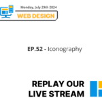
Welcome back to the show. It’s been a weekend and we are back for a packed week. We have a little schedule here. We’ve got some iconography, dark mode, really open issues that’s about tracking and problem solving with WordPress, WordPress training, and we have WordPress 6.6 on Friday. That’s a live demo. So we’re excited about that.
We’re excited about each one this week. We like to, we don’t like to, we just started planning ahead and seeing how that goes. So we’re ready.
We don’t have any set times yet because kids in school, but once school starts, we’ll be doing it maybe around, I don’t know. We’ll figure out a time. Let’s not plan it yet. Sometime throughout the day, we’ll do it. But we’ll say this is the time that we’re doing it. Yeah.
Olympics Excitement
And this week is the Olympics, the start of all the games. So it’s super exciting to see. We’ve been watching gymnastics and cycling, some shooting. Yeah. So we’ve been getting our Olympics. We’re in olypmics mode. Yeah, we are. Trying to pay attention to everything that’s going on, but we’ve been pausing it. Now we’re going to go back and watch the men’s gymnastics after and pretend it’s live, even though it’s not live.
The shooting was weird. I felt very odd looking at it because they just look in the camera with their guns and that’s very odd. But that skill of just staying still is the opposite of almost all the other sports where you have some kind of action going on, activity. It’s about the concentration. It’s definitely different than the others. And it does have to tap into your other types of skills. But I think the hardest thing is like it’s a mental thing. So being able to control your movements with your mind and not get nervous because you’re in the greatest, the largest stage in the world. Some people just actually shake, you know, when you get your nerves. So it’s really interesting. Yeah. Like, he shot somewhere else. He didn’t even shoot on the thing.
National Lipstick Day
Anyways, today is National Lipstick Day, which we were talking about. We’re going to reshare our live stream on lipstick on a pig. That’s what we talked about. Sometimes it’s not best to fix a site. If it’s so far gone, it’s best to redo it. And there are pros and cons to redoing that. We’ll reshare that later and also link it within this live stream because it’s National Lipstick Day.
National Chicken Wing Day
But it’s also national chicken wing day. What is everyone’s favorite flavor chicken wing? I know yours is super hot, super the hotter the better. Yeah, but like the last few times, remember buffalo wild wings and others, I’ve been hurting my stomach and it hasn’t been enjoyable so I gotta tone it down. Three tone that the spice down.
Yeah, I like a little bit of heat, not too much. I’m trying to think which flavor, because there’s so many flavors. Something with a little bit of chili in it, but not too much. But I also like the sweetness, so a nice combo of sweet and chili flavor I think is good. I do like honey flavor too, so I don’t know. Yeah, I feel like you like those garlic parmesan, honey mango flavors. If I was going to make them myself, I like the rosemary onion flavor with a little bit of heat on it.
Actually, I haven’t seen that around here. It’s not like any rosemary flavored heat wings would be nice. That’s true. We should create our own restaurant. We do. Oh, well, I created that. I created my own recipe. One more three times. We’re going to be chicken wing makers. Oh, yeah. So chicken wing day.
We probably will have chicken wings today, whether we make or order them for the Olympics and pretend we’re watching it live, but it won’t be live. Cause we’ve been doing client calls this morning and now this live stream for our public.
Olympics Graphics
So let’s talk about the Olympics though.
One thing that we really noticed watching it this year is the graphics. There’s definitely a different look this year with the choice of imagery, icons, and we’re going to go over some things that stood out to us. It seems a little bit more modern in certain cases and really noticed some differences specifically regarding the choice of icons this year.
Looking for custom iconography? Check out our Web Design + Branding Service!
They’re really weird. I’ll show you some of the ones from the past years actually before we get into that.
Olympic Icons
So like this is from two years ago, you can see how, sorry I said Beijing. Yeah, Beijing 2020. They almost made it look like Mahjong pieces, like the Chinese game. And you can see they look like Chinese symbols. They represent what the sport is. And you can kind of clearly see what they are. This was Winter Olympics, obviously, so it’s a little different. But I can basically tell what each one is without questioning too much, I guess. And that’s what they’re supposed to do.
A good pictogram is a little bit different than an icon in the sense of… They represent something. It’s not abstract at all. It’s really for, I saw it as when I looked into this, different people from different countries are coming to this one event. So the visual should explain what it is without having to read the text, you know?
Exactly. They should be able to look at it and know exactly what sport it is.
These are from 2020 Tokyo. You can see the same deal. Very visual. They’re representing people. Pyeongchang. It’s… Right on the border of North Korea and South Korea. Same thing. These kind of look like… They all look the same, actually. Y
eah. I was going to say, but this year, it’s a little different. And you can see here… What is a little weird, doing some research, every year, if you look at these, it says there’s a person, they related to somebody, a designer who made them, Tokyo. It talks about who the designer was, who the designer was here. But this year, there’s no designer mentioned at all. We were kind of thinking, maybe it’s AI. Maybe they used some program. They really went with a symmetrical look this year.
Thoughts on Iconography
Want to talk about these? Yeah, I want to also point out that this was the first, well, not the first year, but the biggest difference too is the fact that they’re not pictographs.
They’re not considered that because the fact that they’re so abstract, so they can no longer be classified that. And another thing is they don’t have any… people in it maybe that one does but there’s no um actual it’s using the actual sport equipment as the main graphic around it versus yes and saw the others yeah they’re showing the person but almost like just the gear that they’re wearing on their head or like this one only has the uniform there’s no person in it besides the stuff that they’re wearing like invisible people But the problem I have with these is like this one I originally saw and I said, oh, that’s for disc throwing.
But it’s not. It’s for surfing.
Wow. Yeah, because it’s almost too abstract to really even know. Yeah, the abstraction and the symmetry, for me personally, is a little too much. And the fact that, so I’m going to just go really small for a second. This isn’t even as small as you go, but on schedules and stuff at the Olympics, people are complaining because these items look like a little ball of, you know, when it gets small like this, you can’t tell what it is at all, you know, compared to something like this when you zoom out. You can still see that guy’s playing basketball, swimming.
This, I can’t tell what they are. Big, forget it, up close. I mean, from far away. Yeah, they don’t scale down good at all when it comes to, because if you think about it, people go to the Olympics and they go and they have maps and stuff and they have little icons. These are the icons that are on the map on where things are. And you need a magnifying glass probably to really make out what these things are. Yeah, definitely. And even after the magnifying glass, you’re like, what is this right here? Hockey? Is it hockey? No, artistic gymnastics. Oh, my gosh. We are living proof.
Guide to Icons
So Reina made a guide to icons based off all of this information that we’ve been looking up through the weekend and talking about amongst ourselves over the dinner table about iconography. That’s what we do. Called Guide to Icons, Icons, Do’s and Don’ts. Yeah, so we thought about it and we’re like, this is super important. It’s important for websites. It’s important for user experience to be able to look at an icon and have a clear understanding of what you’re looking at.
So with that, the icon should be clear, recognizable, not sitting here like we were just doing for the Olympics and wondering what sport that is. Yeah, I’m just going back to the crazy one. I mean, I don’t see the relation here, artistic gymnastics or what it is. Or even this other one looks like, oh, it’s swimming because the bathing suit. Artistic swimming, yeah. You know what it reminds me of? It reminds me of like optical illusion. Like you look at it and they’re like, what is that? Yeah, what do you see in this? It’s almost like a raw shark image.
You see a dog or a. Yeah, choose clear, recognizable font. And that’s even at a distance. I think that I know you said next, optimize icon size. But you should be able to see these things, especially if they’re not for web. If they’re going to be on a sign or signage or printed on a small flyer, they should definitely be adaptable for large and small sizes. These are probably more adaptable for large. But then even so, it’s still kind of confusing, these new pictograms. Yeah, and I think Icon should only enhance what the sport is, not be a guessing game. It shouldn’t replace the text, but more of being a supportive illustration for what it is. And then really maintain visual consistency. So the icons that you do choose, it should, they should appear similar in the sense of if you have an icon that is filled in, then the other one should carry in the same filled in look for the choice. Or if they’re thin, they should be, the other ones throughout the site should be thin as well. They can be different, obviously icons, but they should look and have the same look and feel. Yeah. There’s nothing like, going on a site and has one that’s a line drawing, one that’s graphic and filled in, one that’s 3D, one that’s flat. Y
ou could just tell it’s unprofessional. That’s why custom iconography is important. I used to be against it. Like, icons, who cares? But having that cohesiveness of a website really gives that instant effect of that’s professional. Even if you don’t really say it out loud, it’s just subconscious. Yeah, definitely. And you should always consider any cultural differences because you don’t want to put an icon that can appear like a different icon that has negative outlook towards certain types of cultures or groups. So making sure to be sensitive in the sense of, okay, would this be offensive to anybody? And looking at it from another set of eyes is important. yeah yeah definitely I was kind of thinking about I don’t know what they have here for the shooting one but if it was like a gun just facing at the it would be a very I wouldn’t say cultural but I think that’s a very aggressive looking icon you know maybe it’s this one right here shooting so it’s just uh but I would say Yeah.
In addition to cultural sensitivity, I think also being sensitive of what you’re actually showing because, oh, gun looks crazy. Even we watched the Olympics opening and it was like this gun facing the camera. I was like, this used to be illegal to put that online. I believe that you couldn’t put a picture. I don’t know how it was managed or enforced, but you couldn’t put a picture of a gun that was facing the camera for a while. That was a big thing. So, yeah.
Iconography Do’s and Don’ts
Back to this beautiful infograph. You want to do the don’ts? Sure. So you don’t want to overload with icons. You don’t want your website just full of icons. It would be really weird and confusing if you just go to a site and there’s just icons everywhere. It’s easy to do, like to add too many icons. I’ve done there. You’re like, oh God, way too many. You just overdo them. Yeah, I’ll be over too much. You don’t want to use confusing, ambiguous icons that people are questioning.
Okay, what is this? What do I do? What does this even mean? And you don’t want to neglect accessibility, meaning you have to think about… meta and also and then also that it will scale down appropriately on a mobile device so people can access it um there so those are some don’ts and the last one I’m trying to pull it up here um don’t use icons means of communication Yeah, you don’t, it goes with like overloading too. It kind of goes hand in hand.
You don’t want to only have these icons and have that the main form of communication on your website. So really being able to enhance, not replace, it goes back to that do point. Yep. Yeah, and just to add to that, the accessibility, all icons should have, if they’re a link, they should have an alt, but also a title because they’re an image. So screen readers can tell this is an icon or pictograph of whatever it might be. And yes, you definitely want text alongside or underneath or on top of icons because you don’t want a chance that someone doesn’t understand. Unless it’s like an app. I feel like apps and stuff on the bottom, like Twitter, those are standard. Like a home button, you know what a home button is. You know what a notification button is. So there are standard ones. But when you get out of that realm and you’re saying, this is a service button for doing decks. I’m not going to know what this deck is. I’m going to think it’s a piece of wood, just like these pictographs. I don’t know what this means. Is this a Band-Aid competition? That’s funny. I was thinking a Band-Aid, too. Really? Yeah. It looks like a Band-Aid. Let’s find out.
The breathable Band-Aids. Skateboarding. Look at that. Come on. Who did this? We’re not fans. By following these tips, you can effectively use icons to enhance your website’s usability, accessibility, and overall aesthetic appeal. Just wanted to drop that last line in there. It’s a nice, I like this graphic. Very nice. Yeah, so I mean, these are the pictograms this year. Again, you can go look at it yourself. Every Olympics, it seems they have their own version. And again, it seems like the person from a person or a designer from the country makes it, but this year it’s a little bit different. I don’t know what they’re doing.
There’s no reference to a designer at all. And the style is just very, very odd. Yeah. I wonder if it’s AI. I wonder if we can scan it through and say, this is an AI image. Wouldn’t that be crazy? Yeah, that would be crazy.
Olympic Obsession and Website
All right. And to add on to our Olympic obsession, we made a site which we’re going to be promoting our landing page really and it’s called go for gold and it’s where somebody can You can come in or you can nominate a site That will win a gold medal and the categories are gonna be personal or they already are personal blog ecommerce site What else is on there? We’ll just scroll through it a little graphic here. So this is a an entry, an entry form or we’ll be judging because we do have a multitude of different skill and talents to look at things such as page speed, which I kind of go over here, navigation, how it looks like on mobile.
So all these things combined, we are going to be giving away a no metal, nothing physical, but we are going to be shouting out the best websites and the best companies on our live streams and linking them, backlinking them into our blog and also describing why it won over others. And also, I was thinking we should pick the worst one too and give it like a second. Yeah, like good job, CounterPrize. So yeah, we have Meet the Judges and it says your website not winning this year fill out this form pretty much if you’re not proud of your website you don’t think it can win any medals fill out that form so we’ve been promoting this starting this morning so if you have a site your site or you know of a site that should be considered and put on our list then please submit a site it’s very simple it’s free Why not? And this is great also for designers, developers.
If you have a site, I think we all have one that we’re super proud of and you want to showcase that, just submit it and we’ll take a look or nominate another fellow business or designer developer and we will be reviewing it. So super excited to take a look at those submissions and get some feedback. Yeah, I’m very excited. Provide our feedback, really. I know. I was going to share the… Just in case anybody is replaying this and wants to go directly to that page and cover us up for a second. But the deadline is August 8th. You can scan that QR code up there.
We are the website judges. And we’re going to feature them again on the live stream and the blog. So… Go forth and prosper. Go for the gold. Go for the gold. That’s even better. Yeah, let me close the screen and get back to looking at you. There we go. That’s better. So what’s tomorrow again? Oh, yes, dark mode. Ooh. I prefer dark mode over anything. I’d rather see it on a black screen Almost black to white, but not. I like off black and off white. It’s better for your eyes. We were talking about it this weekend, and Reina kind of compared it to…
A video game, like a video game site. And I think that is kind of like the vibe a lot of people have with dark mode. Those old sites that are like black, white text, have that edgy look, grungy maybe, or maybe even mechanical. But it doesn’t have to be that way. No. So I’m not coming convinced for any of that. Threetonedigital.com should be in dark mode only. It’s me. It should be light mode now. Yeah, so that’s tomorrow’s. What was the other thing? Oh, yeah, open issues. We’ll talk about these coming up. We don’t want to jump too far ahead. Yeah. That’s it. I mean, I don’t have anything else to say about icons. I do have something to say about chicken wings, and it’s that I really want some.
And I like boneless better than boned. Yeah, there’s definitely more chicken on boneless. I feel like… I don’t know. I’m kind of torn because I feel like bone has that flavor that is really good, but it always is leaving you with wanting more. Boned? Yeah, I can never get enough chicken. There’s never enough chicken, you know? Yeah, I’ve been seeing these memes that are like, oh, it totally destroyed the chicken, and then it’s a couple bites off of it. But I feel like that’s how I eat chicken. I’ve seen how you eat chicken and it’s like a bone. There’s nothing left but a bone. I have a hard time with that because the cartilage, I don’t know. I just get bored of it. And I’m like, I just want a new piece. So everything else like. couple, but I feel personally attacked by that meme. Some people actually eat the bones of the chicken. I don’t know if that’s good for you or not. In certain cultures, they eat the entire bone. I made that broth, and you do have to chop up the bone and blend it with the marrow and stuff. I don’t know about eating them like beef jerky.
Yeah, it says it’s not safe to eat chicken bones, even if they’ve been cooked. I mean, if they’re not, I think it’s more of like a choking hazard, really, if they aren’t chewed properly. But it says it can cause serious health problems eating the bone. Let’s not eat the bone tonight. It can become stuck in your food pipe and windpipe or even intestines. So don’t eat the bones, guys. Don’t go crazy on Chicken Wing Day and eat the entire bone. Don’t go boneless. If anyone was wondering, you should not eat your entire chicken wing bone. Yeah. Don’t follow those directions. I think we should get them from Rusty Nail. Yeah. I was going to say Ravenswood. You weren’t going to think that. What were you thinking? I was going to say Ravenswood, but I think Rusty Nail is the one with the better one. right? Not Ravenswood. I’m not over it. We haven’t gone to Ravenswood in a while, but I did like Rusty Nails, uh, They do have good chicken wings. They really have a good cheeseburger quesadilla, too, which, ooh, maybe I should try to make that. I just took some beef out today. And we have the stuff. So all right, Dan, some ideas for dinner. I know. Enough about iconography. Back to dinner. Yeah, so I mean, that’s all. Do you have anything else to say about icons? I would just say, really, there’s definitely advantages.
And we’ve seen a lot of websites that use icons. And really, if you pick the right ones, it’s going to enhance your content. So it’s important. And that’s why a lot of times designers are brought in to choose the right icons that can really elevate your content. And sometimes you need an expert to help with that. You might think it might be a good icon, but it’s always good to get a second opinion and we can be there to provide that second opinion and our expertise based on what we know and all the websites we’ve created. Yep. And I just want to leave this out here. There is something called a non-project, which we usually direct clients to that we work with for custom iconography. Now, of course this isn’t custom custom, but if you were looking up something, these are all S you can download them as SVGs. And then with a program such as Figma or illustrator, you’re able to merge these things. So say you wanted a piece of paper with a medical symbol on it, and that can become the icon. So this, this type of, we pay for it. What is it? 99 a year. Priceless, though. You can make custom iconography SVG, which is a lightweight vector file, custom. So this is a great site to bookmark if you haven’t, and it’s worth it. I don’t pay for a lot of services out there, but this is one I’ve had for a few years because you can really get custom with it and not have to start from scratch merging stuff together. Oh, you know what we didn’t talk about? Oh, wait, wait, before we get in that, I have something to say about the noun project. You can also change your color right here and download through an SVG. So if you click on it, you can replace it with your brand colors. And this is a great one to use. There’s also other ones, as we know, Canva. If you already have Canva, you can download SVGs icons and use that and replace the colors as well. just some tools that are useful and what we use. Yeah. We don’t want to talk about the, the video. Yeah. So back onto the Olympics. Oh, I know you could do this too.
All right. Non-project. Yeah, so we saw this ad about AI, and we’ve been talking a lot about AI. And Gemini is something that we don’t use, really. I’m more of a chat GPT person. I know some people out there are like, Claude is the better one, or Gemini, or Grok. I don’t even know why. But we saw this ad, and we wanted to play it. So let me open it up full screen. And you should be able to hear it. I don’t hear it. Hello. So I wasn’t sure, but I couldn’t hear anything. For real? Yeah, so I’m not sure if everyone else heard it or if it was just me, but let’s just do… Let’s do a reenactment. Yeah, a reenactment. So he says, he pretty much says, hey, my daughter is a big fan of this runner, Gemini, please help me write a letter like it’s from my daughter to tell the runner thank you, right? Like that’s the plot of it. i mean I have so many things to say about it but my initial thing was like what um if you can’t write a letter again whatever nothing against these people uh the girl maybe I mean she’s not even that young but if you can’t write a letter that just says thank you then why have the ai write it as so fake and I’m just I’m kind of surprised that they’re they’re wording it this way, especially with all the plagiarism stuff, like school and people talking about, oh, this is from AI, you could tell us from AI. Forming a letter to your hero from AI, seems like bad taste to me I maybe I’m thinking too far into it I don’t really care that much either but since we’re talking about it I do have feelings about it and I did have a feeling when I watched it I was like this is not right and they shouldn’t be promoting it this way I’m sure it’s a great system I wrote some things down before you’d say I just want to say like Gemini can pull from Google Search images, which ChatGPT can’t. It has free image generation, which ChatGPT doesn’t. And of course, it’s integrated with everything, Google Docs, Google Sheets, and Drive, and all that. So it does have its benefits. And I’m not talking down about it.
I just feel like the ad leaves this kind of like bad taste in my mouth about AI and children in general. Like, here, use it to do this. What are your thoughts? Yeah, so my thought is I did not like the example as well. I thought that they could have used something else. I think it’s a bad example for young kids to say, oh, if you want to write a letter to your hero, it should come from your heart, not AI. And it’s a good experience to teach your child that. how to write a letter from your heart even if it’s not said in the most eloquent way it is still a learning opportunity it’s just to me I also felt like why use this one and I know they were trying to make this connection between the athletes and stuff to be able to highlight both But to me, AI can help with other things, like more of like try to figure out how to technically do this, you know, as more of a resource for technical things, not a thoughtful letter. You know what I mean? I just, I feel like I didn’t like it either. I think it’s not a good precedence to send out to the world and being like, Write a love letter to your whatever.
That’s what’s coming up for Valentine’s Day. Tell your spouse how much you love them and create a love letter. And then I send you a letter from AI. And then you’re going to look at me like, is this from Gemini or ChatGPT? I’ll be like, I meticulously love your bespoke goodness. Yeah, I agree. Again, like with all the talk about plagiarism and stuff like that, I just think it’s like this is the thing it shouldn’t be used for if there was anything. Everything else is great. It helps you. It teaches you. It improves you, improves your efficiency. But to say, here, take my soul and write a letter, it just seems so weird.
Yeah. Like even from, from running, it could have been like, um, tips on how to, um, like, I don’t know, practice tips on food before your meat, like things like that. Like that is more tip, not like a thank you letter. Like, like a regiment, like run this time, this day, eat this food for protein, et cetera. yeah yeah so definitely something like that so that was our thoughts on the the ai yeah that we saw we’re like uh where’s this world going but every day the olympics you haven’t watched it on the peacock at least they’ve been doing a new commercial like the first day was moana 2 which we saw a hundred times and then yesterday was the peacock commercial right it wasn’t like you know like skadoosh with the kung fu panda we’re not watching it all day And today or yesterday was the Gemini commercial too, but I don’t know what today’s is, but I’m sure we’ll have something to say about it. Yesterday also was LeBron James. Oh, yeah, that’s right. That’s right. You know, I think Landon, he was like, why is he playing with his shirt off? I’m like, I don’t know. They don’t do that on the NBA.
Put on your shirt, LeBron. stop showing off all right what are we doing here no I’m just kidding um yeah I think we covered everything we wanted to then we got the ai video we got iconography versus pictogram pictograms are actual visuals that represent something unless you’re the olympics this year in which case we don’t know what it represents just symmetry um you use iconography on your website To a point, you don’t want to go overboard. Definitely make it accessible. Make it readable. Make it understandable. Use it only when you need to. Don’t go overboard. And I think the use of it is great. I think sites without icons are leaving something less to the imagination that could have been filled in with some icons because not everybody reads a lot. I like to look at pictures and click. See, if I click that icon and I was looking for disc throwing for whatever reason, I would have clicked it and gone surfing. I would have been bamboozled. I’m really excited about these. This is our new business card. Well, one of them. It has a nice little shine to it. It raises off.
I can’t really tell. I got a credit card. I know. This is our black card. Our three-tone black card. It says… Is it coming? It’s not mirror. No, I can see it. Oh, you can? Oh, it looks good to me. But yeah, it says, let us help you create your unique tone. And that’s why it has music notes on it. So kind of creative. These notes are, I was looking at them earlier. You did. The ones on the front are GGG, which is cool. But then the other one is FB. I think FBC. They’re a little off. But that’s like a. On a piano. Yeah. If I got the piano, I’d do it. It’s like a fifth and a sixth. So it’s like a chord kind of. So yeah, these are the new cards. We had to update our logo and take our faces off them because we had new pictures. And as we grow older, we don’t want to be like, here’s our card. Not that we’re going to grow old in the next year. That old. But here’s our card. And then we look like we’re four years old. Here’s our baby picture.
We should just put our baby pictures on. A lot of things in the works there. So we’ll be back tomorrow at an unknown time. You know what I was thinking? We should have a contest like on the radio. What they used to do is be like, listen all day. If you hear the secret word, you win a prize. I was thinking that maybe with these unknown times on our live stream, sometimes that week we give one secret word that they have to tell us, you know, and that they win. That means they watch it and then they win like a $10 gift card or something. yeah that’s my idea um I was also thinking um to put on there as when we reshare the posts um if they watch it to write a common practice they say is to write replay so we can see the time that they’re actually watching it and an idea it’s when to come on because we we’ve been changing the times based on our schedules and also trying to test out uh what is best for the audience so I think that’s what I’ll do I’ll test that out on my end and be like if you write replay yeah so if you see this at any time write replay so we know right now it is a little weird and chaotic we don’t have a set schedule but uh starting september we’ll be on at a certain time every day give or take Whatever.
A couple days. But right now, it’s just kind of whatever. So if you tune in and you hear the secret word of the week, which the secret word… Can I say it? The secret word is Simone Biles. Okay. So at the end of the week, we’re going to ask, and if you are on at that time, it’s a double whammy. Who knows? You might win $10. We might not even give you $10. It’s that so much up in the air. We could take $10 from you, actually. All right. Let’s get out of here. Oh, you want a final word? Yeah. Yeah. Okay. Let’s see if this works. Hmm. All right. Today’s final word when it comes to your website and really in life is to choose imagery icons that add value and really take a moment.
Think about your specific section on your website and figure out, OK, how can I add value? How can I make it easier? for a user to find what they’re looking for and have that to be the final goal, is to really add value to anybody who lands on your page. Final word out.
You are muted. Oh, I went to unmute you and then I muted you. Oh, really? I wasn’t freestyling. All right.
I’m going to play us out with our outro and have a great day. Bye, guys.