Dark mode has become increasingly popular across various devices and platforms, including websites. Many users prefer dark mode as it reduces eye strain, particularly in low-light conditions.
Websites can adapt to users’ preferences by providing an option to toggle between dark and light modes. This customization can enhance user experience and engagement.
Pros of Dark Mode
Dark mode is beneficial for several reasons. First, it reduces eye strain by offering a low-light environment, making it easier for users to read content, especially during nighttime.
Secondly, dark mode can lead to energy savings on devices with OLED or AMOLED screens by using less power to display darker colors. Additionally, studies have shown that dark interfaces can enhance focus and reduce distractions, leading to better user engagement.

Aesthetic Appeal and Industry-Specific Uses
Many users find dark mode visually appealing and modern. It’s particularly popular in industries like gaming and high-end restaurants, where a darker theme can create a luxurious and immersive experience.
For example, a high-end restaurant might use dark mode to enhance the ambiance and draw attention to its exclusive offerings. However, it’s essential to consider the industry and audience when implementing dark mode, as it may not be suitable for all types of websites.
Accessibility and User Preferences
When designing a website with dark mode, it’s crucial to ensure that color contrast ratios meet accessibility standards.
Tools like the Wave extension for Chrome can help check for contrast issues and other accessibility concerns.
Allowing users to toggle between light and dark modes gives them control over their viewing experience and can improve overall satisfaction.
Design Challenges and Testing
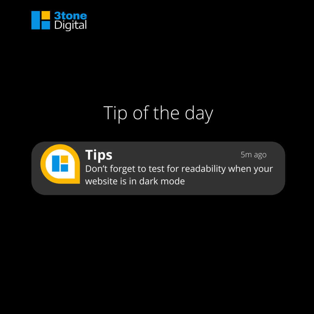
Implementing dark mode can present design challenges, such as ensuring consistency across all elements and avoiding readability issues. It’s essential to test the website thoroughly, considering different devices and screen sizes.
Testing should include checking thank you pages, input forms, and other interactive elements to ensure they display correctly in both light and dark modes. A structured approach during the planning phase can help address these challenges effectively.
Technical Implementation
Using CSS and media queries, developers can implement dark mode by defining different color schemes for light and dark modes.
This approach allows the website to adapt to users’ preferences seamlessly. For instance, media queries can detect if a user prefers dark mode and automatically apply the appropriate styles. This method ensures a consistent user experience across different devices and browsers.

Final Thoughts
Dark mode can significantly enhance user experience by reducing eye strain, saving energy, and providing a modern, visually appealing interface. However, it’s essential to consider accessibility, design consistency, and thorough testing when implementing dark mode.
By allowing users to toggle between light and dark modes, websites can cater to individual preferences and improve overall engagement.
